Wednesday, July 15, 2015
My Blog Has Moved
My blog has moved over to my main domain, ashleywalters.net. I've completely redone my website where I plan to offer brushes, prints, and giveaways. You can also find me on facebook and twitter. Be sure to like and follow me for the most up-to-date info and artwork.
Wednesday, October 31, 2012
Artist Spotlight- Hamsterfly (AKA Viktor Titov)
Happy Halloween everyone! Every artist
benefits from looking at other people's art. As my college sculpture
professor would say, you can't have good output without good input.
In my journey of personal discovery, I have come to admire many
people in the industry. This is certainly true of Viktor Titov,
whose brilliant use of painterly strokes juxtaposed with accurate
form catches my eye among a sea of other fantasy artists.
Book cover again by *Hamsterfly on deviantART
Uncle Eear by *Hamsterfly on deviantART
Slavemarket by *Hamsterfly on deviantART

And to the friends and family on the east coast, I am sending warm thoughts your way. Stay safe!
Book cover again by *Hamsterfly on deviantART
What makes his work so unique is his
ability to add artistry into every piece without overworking it. In
an interview with Imagine FX Victor attributes this affect to his
practice of “trying to emphasize some details
and then [rubbing] them off because they’re too obsessive and they
occupy the central part of the composition.” Regardless of
how he does it, it comes off as effortless. It's not easy creating
art so loose and yet so detailed.
Uncle Eear by *Hamsterfly on deviantART
Slavemarket by *Hamsterfly on deviantART
I couldn't help but see a lot of
another favorite artist in his work, the celebrated Craig Mullins.
Indeed he has stated Craig to be an inspiration in some of his work.
In my own journey to enhance my loose
skills like Viktor, I have come across some amazing resources. First off, I tried
Marta Nael's Digital Impressionism tutorial. Here's the result:
I must confess though, it would have
not been possible without some amazing brushes by some amazing
people: Titus Lunter's Brushes and
Brushes by Levi
(scroll down to the end of the page for the link). The other secret
I have discovered is the Unsharpen Mask filter in photoshop. Try it sometime-
it creates instant detail! It really makes it pop.
I feel kind of like a hypocrite because
I frequently tell people that there is no secret brush or secret
filter that will automatically make your work great. No I take that
back, I don't feel too bad about it because the problem is not using
tools as a means to an end, but using tools to make up for you lack
of skill. In this case these tools enhanced the ability I already
possessed to help create a looser look. Try the tutorial if you have
some time.
So tell me, who influences you?
So tell me, who influences you?
In other news, I was ecstatic to
receive my copy of Expose 10 and find that I had been given an
Excellence Award for the steampunk category on page 276. It printed
pretty well, which was great because the proof they sent looked a
little odd.


And to the friends and family on the east coast, I am sending warm thoughts your way. Stay safe!
Saturday, September 29, 2012
The Dangers of Working For Free
As an artist, I've had my fair share of people asking for free work. I try to respond kindly with a thanks but no thanks. Sometimes they reply with an, "oh I understand, thanks anyway". Sometimes the person responds with self righteous anger, balking at the thought that something like a few character concepts should be paid for.
Perhaps you have been in the same situation. It usually consists of promises of unicorns and golden rays of sunshine that will come once the project is complete. "See, we aren't making money yet" the person will tell you, "so we can't pay you anything now but when the project starts making lots of money we'll all share it". Riiiiight...
Let me outline the dangers artists face by falling for these types of projects. First we need to outline the types of people that come knocking. They usually fall into one of the following categories:
Now don't get me wrong, I am not knocking on artists who give their time to charitable causes. After all, there are a few perfectly legitimate times when you may want to say yes to giving free work, but be careful. I'll go into this later.
Let's get back to the problem here. The reason why people ask for free work in the art industry is simple- they under value the worth of art. There is this false belief that somehow skilled artists are magical people who can just "whip something up" and it's no big deal. They think it doesn't take time, and whatever time it does takes simply isn't worth paying for upfront because art is everywhere.
These "unfinanced entrepreneurs", as comic illustrator Mark Evanier refers to them, simply don't realize or appreciate the sheer amount of work they are requesting for the mere chance of getting paid at a later date. In his words, "Unfinanced entrepreneurs don't have any money — or, if they do, they're not dumb enough to risk it on their own projects. They want you to assume the risk." So true. What's funny is that it's these very people who don't see how true it is.
Imagine for a second the following scenario. You are contacted via e-mail by a guy who claims to have this amazing idea. He starts off by telling you how great the project is and that once it takes off, you will have a share in the profits, all he needs is someone to bring his vision to life. Think for a minute, if it's that great of a project and sure to make money, surely he could front a little of his own money to hire professional work and get his money back when the project takes off no problem. But no, the minute you suggest the very thought of investing in his own project he starts making excuses as to why he can't. Then he starts throwing out phrases like "couldn't you this or that", "in your spare time", "whip something up" (as if illustrating a complex scene takes only 30 minutes). So, what he really wants is for YOU to forgo paying projects to spend time on HIS project for free. It's not like he's asking you to put your own money into the project or anything. (Cue rolling eyes). Essentially he's asking you to hold all the risk.
It's during situations above that I want to ask the other person what he or she does for living. My response may be something like this: "Oh, you work in construction? Hey, since we're buddies here, I need a fence hole dug in my yard. I mean I can't pay you, but could you do it in your spare time, like on the weekends or something? When it's all done I may win the monthly best yard award and then I could pay you. It's only a couple of days worth of work after all. Better yet, why not just offer your services for free to everyone? I mean surely you must be in the construction business because it's your passion. Money shouldn't matter to you, right?" I can only imagine their stammering response.
Perhaps in a perfect world we wouldn't need money. I would love to work for free but I can't eat for free and I can't live for free. What's more, I spent money to go to college to earn a 4 year degree in art. It wasn't some magical skill that just appeared one day that took no time to acquire. When someone hires me, they are paying for my expertise and knowledge and the blood sweat and tears it took to earn it. Don't undervalue your worth. The other guy will always want to get the most they can for the least amount possible. If you don't stand up for yourself, no one else will.
If I could get more people to see the ridiculousness of even asking for something like this artists all around the world would have more time to be productive instead of answering these crazy proposals with another monotonous, "thanks but no thanks".
So what are the dangers of accepting such offers? There are plenty.
There was one common underlying theme from all the scenarios above- don't underestimate the importance of contracts. If they squirm at having in writing getting paid at a later date, RUN. Legitimate project managers and companies have no reason to be scared of a piece of paper. It's the people who want to promise you the moon and throw out words like "trust" or "why bother with contracts" who plan to skip out on you who don't like to be tied down. I strongly suggest you ask for 50% upfront and 50% once the project is complete. Most clients aren't going to have a problem with this.
Now I realize there are artists of all levels who read my blogs. Some of you may wonder if any of the above applies to you. Here's the real question- if you want to work as a professional artist you need to ask yourself if you are at that level. If you are, you should be paid for your work. If you are not, spend your time getting to that level. If along the way you want to take on some free projects to help boost your portfolio, tread carefully. You will likely get burned. Your time is of value. Don't waste it.
In the words of Mark Evanier, "You have a limited amount of creative energy. It's finite, if only because there are only so many hours in a day. Value that creative energy. Because if you don't, no one else will."
Perhaps you have been in the same situation. It usually consists of promises of unicorns and golden rays of sunshine that will come once the project is complete. "See, we aren't making money yet" the person will tell you, "so we can't pay you anything now but when the project starts making lots of money we'll all share it". Riiiiight...
Let me outline the dangers artists face by falling for these types of projects. First we need to outline the types of people that come knocking. They usually fall into one of the following categories:
- They are doing it just for fun with some friends in some basement and therefore aren't serious enough about it to pay for anything. They are doing for the lulz and surely an artist like you isn't in it for money either.
- They truly believe they have a guaranteed next big multimillion dollar hit and expect you to bring it to life so that one day both of you can sip margaritas on some paradise island toasting to your new life of luxury even though they have no prior experience in the field they expect to break into (what I like to call, delusions of grandeur).
- They work for some non-profit company and hope that they can pull on your heartstrings enough to guilt you into working for free.
- Or the worst of the worst- They work for a "start up" publishing company and promise you exposure and lots of future work (not necessarily paid work either) if you agree to work on a few projects for free. Essentially, they want a sucker and a slave.
Now don't get me wrong, I am not knocking on artists who give their time to charitable causes. After all, there are a few perfectly legitimate times when you may want to say yes to giving free work, but be careful. I'll go into this later.
Let's get back to the problem here. The reason why people ask for free work in the art industry is simple- they under value the worth of art. There is this false belief that somehow skilled artists are magical people who can just "whip something up" and it's no big deal. They think it doesn't take time, and whatever time it does takes simply isn't worth paying for upfront because art is everywhere.
These "unfinanced entrepreneurs", as comic illustrator Mark Evanier refers to them, simply don't realize or appreciate the sheer amount of work they are requesting for the mere chance of getting paid at a later date. In his words, "Unfinanced entrepreneurs don't have any money — or, if they do, they're not dumb enough to risk it on their own projects. They want you to assume the risk." So true. What's funny is that it's these very people who don't see how true it is.
Imagine for a second the following scenario. You are contacted via e-mail by a guy who claims to have this amazing idea. He starts off by telling you how great the project is and that once it takes off, you will have a share in the profits, all he needs is someone to bring his vision to life. Think for a minute, if it's that great of a project and sure to make money, surely he could front a little of his own money to hire professional work and get his money back when the project takes off no problem. But no, the minute you suggest the very thought of investing in his own project he starts making excuses as to why he can't. Then he starts throwing out phrases like "couldn't you this or that", "in your spare time", "whip something up" (as if illustrating a complex scene takes only 30 minutes). So, what he really wants is for YOU to forgo paying projects to spend time on HIS project for free. It's not like he's asking you to put your own money into the project or anything. (Cue rolling eyes). Essentially he's asking you to hold all the risk.
It's during situations above that I want to ask the other person what he or she does for living. My response may be something like this: "Oh, you work in construction? Hey, since we're buddies here, I need a fence hole dug in my yard. I mean I can't pay you, but could you do it in your spare time, like on the weekends or something? When it's all done I may win the monthly best yard award and then I could pay you. It's only a couple of days worth of work after all. Better yet, why not just offer your services for free to everyone? I mean surely you must be in the construction business because it's your passion. Money shouldn't matter to you, right?" I can only imagine their stammering response.
Perhaps in a perfect world we wouldn't need money. I would love to work for free but I can't eat for free and I can't live for free. What's more, I spent money to go to college to earn a 4 year degree in art. It wasn't some magical skill that just appeared one day that took no time to acquire. When someone hires me, they are paying for my expertise and knowledge and the blood sweat and tears it took to earn it. Don't undervalue your worth. The other guy will always want to get the most they can for the least amount possible. If you don't stand up for yourself, no one else will.
If I could get more people to see the ridiculousness of even asking for something like this artists all around the world would have more time to be productive instead of answering these crazy proposals with another monotonous, "thanks but no thanks".
So what are the dangers of accepting such offers? There are plenty.
- Let's go back to the first client example, the guys making a game for fun.
You are into to games and it seems like it would be a good match for your portfolio. Also, it does kind of makes sense that if they aren't making money, they can't pay you right now. Maybe you could work it in. I mean, what if it hits it big and you missed on an amazing opportunity to be noticed? You could have been doing the concept art for the next Halo game for crying out loud!
Hold on there sparky. These guys aren't professionals. The chances of their game even being finished when it's done in everybody's "spare time" is so remote it's not even funny. And if in the one in a billion chance they do make it big, you better have something in writing or fat chance getting any slice of the pie. You did it for free after all. (Cue sarcasm) Obviously you just wanted to do it on your own so they don't owe you royalties or rights to the characters. If they don't seem like serious clients, chances are they aren't going to take you seriously either. Trust me, you don't want to go there. - Now let's look at the second client- the guy who has the golden idea. We've already talked a little about this but let's say it again- most big ideas are not so big. If they aren't already in the field they profess they are suddenly an expert in, tread carefully. Actually just go the other way unless he makes it worth your time. If his idea isn't worth his own money, it's not worth your time end of story. Also remember, all he has is an idea. He's relying on you to make it happen and no doubt plans to pay you a fraction of what he earns because after all it, it was his idea. He wants you to do all the work and take all the risk so that HE can have all the reward. Even if someone like this is willing to pay, be sure you get a solid contract.
- Now let's talk about doing work for the non-profit cause client. Be careful here. Just because a business isn't profitable doesn't mean that the business is "non-profit". If you are contacted by a third party like a marketing firm or ad agency working for a charity you are entitled to ask if they in fact are doing their part of the work for free. If they are getting paid, they should have it in the budget to pay you too. Also, if you don't agree with their cause don't do the work. You don't want your name plastered by something that makes your skin crawl. If it's a great cause, and you want to do it, be sure you clearly outline what you are willing to do so that there are no surprises.
- And lastly- the start up publishing company. They promise exposure, they promise the world, all for the low price of only- your soul. Don't do it. You will become a slave. The companies are in the business of making money and they should know better. "Start-up" or not, if they want professional talent they need to be willing to pay for professional talent. If they don't use professional talent they aren't likely to stay in the business for long. If they promise to pay you at a later date you better have a solid contract that includes a phrase akin to- I'm getting paid regardless of the success of this project on this date.
There was one common underlying theme from all the scenarios above- don't underestimate the importance of contracts. If they squirm at having in writing getting paid at a later date, RUN. Legitimate project managers and companies have no reason to be scared of a piece of paper. It's the people who want to promise you the moon and throw out words like "trust" or "why bother with contracts" who plan to skip out on you who don't like to be tied down. I strongly suggest you ask for 50% upfront and 50% once the project is complete. Most clients aren't going to have a problem with this.
Now I realize there are artists of all levels who read my blogs. Some of you may wonder if any of the above applies to you. Here's the real question- if you want to work as a professional artist you need to ask yourself if you are at that level. If you are, you should be paid for your work. If you are not, spend your time getting to that level. If along the way you want to take on some free projects to help boost your portfolio, tread carefully. You will likely get burned. Your time is of value. Don't waste it.
In the words of Mark Evanier, "You have a limited amount of creative energy. It's finite, if only because there are only so many hours in a day. Value that creative energy. Because if you don't, no one else will."
Saturday, July 7, 2012
The Learning Curve
Ever look at your art and realized it stinks? Like “how could I have ever have drawn that” kind of stinkage? I had a moment like that recently. I did this piece last year and tried to enter it in a book.

Naturally it didn't get selected. I totally can see why now. The face is anatomically incorrect, the colors are blah, and I was trying emulate somebody else's soft style and it just never quite worked.
While studying the work of people you admire is a great way to discover new techniques, in this case I felt hindered the entire time. It just never clicked. As much as I like Ruoxing Zhang's super soft style, it's just not me. So I've been reworking it slowly in between projects. Here's a sneak peek:
 Much better. It's slow going as I am really focusing on the tiny details. I have found that varied brushes have really helped this piece evolve. I have also learned not to be afraid of hard edges and texture. I really think my use of texture is what gives my work it's realism.
The whole process had taught me a lot.
First- don't get cocky. You think it's hot but really it isn't. Sometimes it takes an honest buddy to tell you the truth. If you can't find one I suggest conceptart.org. They'll hand your butt to you but at least you'll have a fresh pair of eyes. Be humble and accept crit with grace. You'll get better much faster when you realize you aren't all that.
Second- step away. If you are like me this is hard. I tend to get “in the zone” and nothing else matters until it's done. The problem is your eyes get accustomed to seeing the piece and you lose your ability to detect mistakes. In my case, it took months of leaving the piece alone before I could see what was wrong with it. You don't have to wait that long but give it a day or two. Flipping the image also helps you to see things in a new light which can point out mistakes you otherwise missed.
Third- sometimes it better when you don't make the cut. Boy am I glad that image didn't get selected for publication. The last thing I want is to turn off a client because of a poor image. It also pushes you to do better when you get knocked down once in a while. Some of my most painful art experiences have driven me to new heights. I've come to know my own ambitions much better after having them tested.
Fourth- your ability to see mistakes increases as you get better. I was surprised by how much was wrong when I did this piece just last year but that's a good thing. It means I have improved! For most of us, the process of getting better takes a long time. Stick through it. Sometimes you can see your mistakes but you just don't know how to fix them. Times like that are the most frustrating of all. I stumbled across this profound quote on facebook which seems to sum it up well:

If you are an aspiring artist please take it to heart! In the words of Galaxy Quest- “Never give up, never surrender!”
That doesn't mean it won't be a difficult process. When I decided to try digital painting at the end of 2009 I knew it was going to be painful. Hours of work got me sub-par results. I've come a long way. I still learn new things every time I paint. So keep it up!
What keeps you going when times are tough?

Naturally it didn't get selected. I totally can see why now. The face is anatomically incorrect, the colors are blah, and I was trying emulate somebody else's soft style and it just never quite worked.
While studying the work of people you admire is a great way to discover new techniques, in this case I felt hindered the entire time. It just never clicked. As much as I like Ruoxing Zhang's super soft style, it's just not me. So I've been reworking it slowly in between projects. Here's a sneak peek:

The whole process had taught me a lot.
First- don't get cocky. You think it's hot but really it isn't. Sometimes it takes an honest buddy to tell you the truth. If you can't find one I suggest conceptart.org. They'll hand your butt to you but at least you'll have a fresh pair of eyes. Be humble and accept crit with grace. You'll get better much faster when you realize you aren't all that.
Second- step away. If you are like me this is hard. I tend to get “in the zone” and nothing else matters until it's done. The problem is your eyes get accustomed to seeing the piece and you lose your ability to detect mistakes. In my case, it took months of leaving the piece alone before I could see what was wrong with it. You don't have to wait that long but give it a day or two. Flipping the image also helps you to see things in a new light which can point out mistakes you otherwise missed.
Third- sometimes it better when you don't make the cut. Boy am I glad that image didn't get selected for publication. The last thing I want is to turn off a client because of a poor image. It also pushes you to do better when you get knocked down once in a while. Some of my most painful art experiences have driven me to new heights. I've come to know my own ambitions much better after having them tested.
Fourth- your ability to see mistakes increases as you get better. I was surprised by how much was wrong when I did this piece just last year but that's a good thing. It means I have improved! For most of us, the process of getting better takes a long time. Stick through it. Sometimes you can see your mistakes but you just don't know how to fix them. Times like that are the most frustrating of all. I stumbled across this profound quote on facebook which seems to sum it up well:
If you are an aspiring artist please take it to heart! In the words of Galaxy Quest- “Never give up, never surrender!”
That doesn't mean it won't be a difficult process. When I decided to try digital painting at the end of 2009 I knew it was going to be painful. Hours of work got me sub-par results. I've come a long way. I still learn new things every time I paint. So keep it up!
What keeps you going when times are tough?
Wednesday, February 29, 2012
The Art of Marketing
So as you could probably tell, I've been hiding in my lair working like crazy. (Well perhaps you can't tell- most of my work is under non-disclosure at the moment but that's another story). While this has kept me busy, I have realized that I have let my "presence" slip. It's my hope to keep this blog updated at least once a month. Look at me posting the last day in February to try and keep to the schedule- and leap day no less. Ha!
At any rate, it's time to step it up. I am ready to move into the new phase of marketing. I haven't been advertising myself to the public because I have enough repeating projects to keep me busy. However hiding in a tar pit of endless work is not the way to expand your clientele. You never know when you dream job is going to pop up so put yourself out there. For me, that would be painting cards for Magic the Gathering, doing concept art for Riot games, or anything at all for Blizzard.
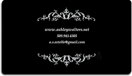
So here's a start. I know it's not groundbreaking, but I've made business cards! Last week I found myself in a situation where I wish I had one to hand out. Fate favors the prepared. You never know who may wish to use your services or who a client may know.
So here I have two designs and the back which will work for either card. Please give me some input on these. I would love some CC on what you think is working and what I could do better.


So here I have two designs and the back which will work for either card. Please give me some input on these (but bear in mind they are calibrated for print and blogger has overly saturated them the compression is atrocious, blah). I would love some CC on what you think is working and what I could do better. I couldn't pick between the two pictures as each one caters to a different possible client. The close up of the eyes speaks to the client who wants something captivating and mysterious while the concept art shows my figurative skills to a potential art director for a video game company.
I went through several designs of the card (text, before picking this one. I new from the beginning the card needed to mimic my website in appearance. This was for two reasons. First, it is important for marketing imagery to be consistent across all platforms. This is so that clients are more easily able to put a name to a face. Second, I already had files in place so theoretically it shouldn't have taken so long to design. That one didn't pan out. I still spent all day on the thing.
Next my goal is to branch out and purchase some overhead expenses for conventions and selling prints online. It's time for me to offer my work to the world. Eventually I want to make a deck of cards, calendars, and puzzles. I can then sell them at conventions or on online stores like zazzle. If you didn't know, you can technically purchase some of my work at deviantart.com. I don't sell much there as I don't promote it at all. The biggest thing keeping me from reaching this goal is that I have not allotted time for personal projects in my schedule. This is counter-intuitive as I am not able to sell prints of the majority of the work I have been creating lately.
So if you were sitting on the fence about making a presence for yourself just do it. You can have a quick blog up like this in no time. Blogger is great for that. And business cards are a very affordable way to say here I am!
What do you do to market yourself? Share your tips and tricks with us!
At any rate, it's time to step it up. I am ready to move into the new phase of marketing. I haven't been advertising myself to the public because I have enough repeating projects to keep me busy. However hiding in a tar pit of endless work is not the way to expand your clientele. You never know when you dream job is going to pop up so put yourself out there. For me, that would be painting cards for Magic the Gathering, doing concept art for Riot games, or anything at all for Blizzard.
So here's a start. I know it's not groundbreaking, but I've made business cards! Last week I found myself in a situation where I wish I had one to hand out. Fate favors the prepared. You never know who may wish to use your services or who a client may know.
So here I have two designs and the back which will work for either card. Please give me some input on these. I would love some CC on what you think is working and what I could do better.
So here I have two designs and the back which will work for either card. Please give me some input on these (but bear in mind they are calibrated for print and blogger has overly saturated them the compression is atrocious, blah). I would love some CC on what you think is working and what I could do better. I couldn't pick between the two pictures as each one caters to a different possible client. The close up of the eyes speaks to the client who wants something captivating and mysterious while the concept art shows my figurative skills to a potential art director for a video game company.
I went through several designs of the card (text, before picking this one. I new from the beginning the card needed to mimic my website in appearance. This was for two reasons. First, it is important for marketing imagery to be consistent across all platforms. This is so that clients are more easily able to put a name to a face. Second, I already had files in place so theoretically it shouldn't have taken so long to design. That one didn't pan out. I still spent all day on the thing.
Next my goal is to branch out and purchase some overhead expenses for conventions and selling prints online. It's time for me to offer my work to the world. Eventually I want to make a deck of cards, calendars, and puzzles. I can then sell them at conventions or on online stores like zazzle. If you didn't know, you can technically purchase some of my work at deviantart.com. I don't sell much there as I don't promote it at all. The biggest thing keeping me from reaching this goal is that I have not allotted time for personal projects in my schedule. This is counter-intuitive as I am not able to sell prints of the majority of the work I have been creating lately.
So if you were sitting on the fence about making a presence for yourself just do it. You can have a quick blog up like this in no time. Blogger is great for that. And business cards are a very affordable way to say here I am!
What do you do to market yourself? Share your tips and tricks with us!
Monday, January 2, 2012
Sketching with Sketchup
Ever heard of the free 3D program Google SketchUp? A couple of months ago I ran across the term in the description of work on deviantart. It looked similar to this:
Raven by *KaranaK on deviantART
Not bad, eh? It sparked my curiosity which lead me to the SketchUp blog.
Apparently illustrators are catching onto it like wildfire. The GS blog recently featured a prominent illustrator in the field named Harold Belker who describes how he uses the program to aid him in the creation of his jaw-dropping work. What convinced me to brave the painful learning process was his comment: "I literally use SketchUp the way I used to sketch with a pencil". I was awed that working in 3D could be faster than working traditionally. Any tool to increase my productivity is worth a bit of tinkering. And free too? Sold.
Now I'm no 3D expert but even I can work my way around the program. The software isn't bloated and the tutorials are easy to follow. I can mock something up fast and use it as outlined perspective reference instead of having it do ALL the work for me like other programs. After all, as a concept artist there is a limit to how much work I should be doing in 3D when it is about to be put in 3D anyway. Am I right?
The biggest reason why I like it: it's an excellent time saver. Now I am used to having to draw things by hand using the see-through construction drawing method learned in my college days (no rulers allowed), but these drawings take time- precious time when you have a deadline to make.


So when I had the chance to mock up a lovely tank for a book cover I jumped on it. I was able to move to the painting stage much faster. Now I still have a lot to learn about Google SketchUp but once I get past the learning stage this program will become an even greater efficiency booster.


Remember my article about DAZ? Since then I have been getting better with the program every time I open it. Except for it's massively high crash rate (save frequently folks), it does a fair job of capturing great angles I couldn't otherwise capture. AND I have just learned how to put GS models INTO DAZ and incorporate them into scenes. Not bad huh?
So far, I prefer using these tools as a means to an end- in other words I am not going to be jumping into 3D work any time soon. I prefer 2D and I prefer drawing things out by hand. I don't have a problem occasionally painting over things I have mocked up in GS because I have built the shapes myself from the ground up and they are unshaded and simple outlines, but I don't over-paint DAZ figures. I think that would limit the gesture and grace in my work. I don't want my skills going dull on me. So yes, I suggest these programs but I do so with some fine print attached. Don't let any artistic tool become a crutch.
I am a firm believer that one should gain all the basic skills of art before taking any shortcuts. This is why when people ask me for advice on learning how to draw I always suggest working from the ground up in traditional medium. First learn the principles and elements of design, then learn perspective by doing construction line drawings, then learn value and light-sourcing by drawing spheres, cones, blocks, and eggs, then draw objects from life, then faces, then figures. Then learn to paint still life and landscapes, then faces, then figures, then illustrative scenes, AND THEN move to digital medium. I highly recommend art school for anyone who is serious about becoming a professional artist. The amount of time, devotion, and guidance needed to achieve a professional level in a portfolio is nearly impossible to attain on one's own in the same amount of time. Yes, there are many self taught artists out there who do fairly well but they will always be limited by what they don't know. Landscape artists may have trouble painting a realistic figure with accurate proportions, portrait artists may find that creating a scene from imagination is difficult, etc. These artists are perfectly fine when they don't step out of their box but someone in the commercial art field is required to draw just about anything from nothing. You don't have to be limited. It is up to you to know your weaknesses and decide to fill them. I find that most people who ask me how to draw don't really want to know the truth. They want a quick and easy solution to being a professional. There isn't one. The portfolio speaks for itself.
So while I advocate DAZ studio and Google SketchUp, it is not meant to replace the valuable process of learning construction drawing and figure drawing but serve as a tool to enhance what you already know.
What programs and tools do you use to help your art?
Friday, October 21, 2011
More Crits!
I will be updating this post as I get more crits in. I will try and do one or two a day for the next week until we are all finished up.
Our next lovely image comes from a long time friend of mine, LA-Fairy. As her name implies, she enjoys drawing fairies. Before I begin I must say that her art has made a great improvement over the years.


That being said here are the changes I would make. First, you are thinking linearly instead of in terms of light and shadow. There is no clear light source and there seems to be conflicting shadow areas in the face versus the rest of the body. So I decided to go with the body shading and take it from there. That means there is a lovely primary light source to her upper right, our left. Light source is very important because it determines how the form will be rendered. Be sure to have a clear light side and a clear dark side with consistent values on either side.
One other thing, the first thing I noticed when I saw this image was that the contrast was very very low. If you put a layer of black turned to saturation mode you will see very quickly that your figure is hard to distinguish from the background. With that in mind, I separated her from her background onto her own layer and popped the contrast immediately on both layers. Contrast is very important. It helps guide the eye to know what to look at and to better understand what is being seen.
Here is the finished contrast difference:


Taking what you already did in the legs, I fleshed out the forms more to show roundness while thinking about core shadow. Core shadow will be perpendicular to the light source and in this case ought to hit about halfway in her thigh and legs with variations based on the volume and roundness. From there I added some cast shadows hitting her thighs. I altered her shoulders and chest to make them more painterly instead of fully outlined. This gives the illusion of depth and will make your work more realistic. From there I changed the hair to include a clear light and shadow side instead of just strings of light and dark. I also added some large chunks fanning outward from her face as that is what would happen if she were really flying around. Also, as I played with the light source I could soon see that the shadow was in the wrong place. The shadow will be at the same angle as the light source. In this case, it is slanting in from the left so the shadow needed to be moved to the right.
I did alter some proportions as I went along. Mainly, the shoulders were a little out of place and the hands and fingers were too small. I didn't bother with reference so you may want to find some or if you do have some, think about proportion and size in relation to the rest of the figure to really get those areas down. Lastly I added some soft green rim lighting to define the form on the other side of her. One thing I did not play with much was the background. You will want to spend more time thinking about how it relates to the figure. You'll notice I did crop the image as there was too much empty space and the composition was getting a bit boring. Perhaps in the future you may think about having a more dynamic pose. Studying line of action may be of help.
Overall, I think you just need to think about light source and contrast. I would also think about the purpose of each image you create. Is it meant to be on the front of a greeting card? Should there be more of a background? Or is it a quick character concept? These are things that will change how the work evolves and what should be included.
While doing this critique I realized that in the future I will want to live stream these so I can explain exactly why I am doing what I am doing when I paint over them. I think it will be a great resource to everyone who wants to know why I make these changes.
Our next image comes from Chris.

As this image is coming from a beginner, as he called himself, I will keep my critic simplified. What I do see are some large blocks of color which is good for starting out. It looks to me like you used some sort of photo for reference. This can be okay to do from time to time but I have found that in the beginning stages of learning art, drawing from life helps you to see shapes 3 dimensionally. This allows you to understand the correlation between spacial planes to a higher degree than drawing from a 2 dimensional photograph where you have only one flat view of the object/subject matter. Also, starting by drawing cones, blocks, and eggs are a great way to focus on learning how to render value without worrying about complex shapes typically found in the face and figure. This is what I recommend for most beginners. Once you have mastered that, drawing portraits would work the same way. Basically, you would want to think in terms of light and shadow and not in terms of drawing the eye, the nose, and the lips. What I mean is, instead of drawing element by element, draw the general blocked in shapes of light and shadow. Turning your image upside down will also help you see these relationships without thinking about your predetermined notions of what an eye or a nose should look like. As this particular piece is in the early stages, and I don't have the reference you used to look off of, I think a paint-over may not be helpful. I will however recommend that you show some sort of a light source as this will help you give some depth to your work. As it is, the large blocks of color don't have enough range of value and look a bit flat. For a beginner however, the proportions look to be in about the right place. If you can do this freehand, you will have a far greater advantage than if you trace, so try to do it freehand whenever you can. It will keep your skills sharp. ;)
Thanks so much for your patience! Expect another one tomorrow!
Our next lovely image comes from a long time friend of mine, LA-Fairy. As her name implies, she enjoys drawing fairies. Before I begin I must say that her art has made a great improvement over the years.


That being said here are the changes I would make. First, you are thinking linearly instead of in terms of light and shadow. There is no clear light source and there seems to be conflicting shadow areas in the face versus the rest of the body. So I decided to go with the body shading and take it from there. That means there is a lovely primary light source to her upper right, our left. Light source is very important because it determines how the form will be rendered. Be sure to have a clear light side and a clear dark side with consistent values on either side.
One other thing, the first thing I noticed when I saw this image was that the contrast was very very low. If you put a layer of black turned to saturation mode you will see very quickly that your figure is hard to distinguish from the background. With that in mind, I separated her from her background onto her own layer and popped the contrast immediately on both layers. Contrast is very important. It helps guide the eye to know what to look at and to better understand what is being seen.
Here is the finished contrast difference:

Taking what you already did in the legs, I fleshed out the forms more to show roundness while thinking about core shadow. Core shadow will be perpendicular to the light source and in this case ought to hit about halfway in her thigh and legs with variations based on the volume and roundness. From there I added some cast shadows hitting her thighs. I altered her shoulders and chest to make them more painterly instead of fully outlined. This gives the illusion of depth and will make your work more realistic. From there I changed the hair to include a clear light and shadow side instead of just strings of light and dark. I also added some large chunks fanning outward from her face as that is what would happen if she were really flying around. Also, as I played with the light source I could soon see that the shadow was in the wrong place. The shadow will be at the same angle as the light source. In this case, it is slanting in from the left so the shadow needed to be moved to the right.
I did alter some proportions as I went along. Mainly, the shoulders were a little out of place and the hands and fingers were too small. I didn't bother with reference so you may want to find some or if you do have some, think about proportion and size in relation to the rest of the figure to really get those areas down. Lastly I added some soft green rim lighting to define the form on the other side of her. One thing I did not play with much was the background. You will want to spend more time thinking about how it relates to the figure. You'll notice I did crop the image as there was too much empty space and the composition was getting a bit boring. Perhaps in the future you may think about having a more dynamic pose. Studying line of action may be of help.
Overall, I think you just need to think about light source and contrast. I would also think about the purpose of each image you create. Is it meant to be on the front of a greeting card? Should there be more of a background? Or is it a quick character concept? These are things that will change how the work evolves and what should be included.
While doing this critique I realized that in the future I will want to live stream these so I can explain exactly why I am doing what I am doing when I paint over them. I think it will be a great resource to everyone who wants to know why I make these changes.
Our next image comes from Chris.

As this image is coming from a beginner, as he called himself, I will keep my critic simplified. What I do see are some large blocks of color which is good for starting out. It looks to me like you used some sort of photo for reference. This can be okay to do from time to time but I have found that in the beginning stages of learning art, drawing from life helps you to see shapes 3 dimensionally. This allows you to understand the correlation between spacial planes to a higher degree than drawing from a 2 dimensional photograph where you have only one flat view of the object/subject matter. Also, starting by drawing cones, blocks, and eggs are a great way to focus on learning how to render value without worrying about complex shapes typically found in the face and figure. This is what I recommend for most beginners. Once you have mastered that, drawing portraits would work the same way. Basically, you would want to think in terms of light and shadow and not in terms of drawing the eye, the nose, and the lips. What I mean is, instead of drawing element by element, draw the general blocked in shapes of light and shadow. Turning your image upside down will also help you see these relationships without thinking about your predetermined notions of what an eye or a nose should look like. As this particular piece is in the early stages, and I don't have the reference you used to look off of, I think a paint-over may not be helpful. I will however recommend that you show some sort of a light source as this will help you give some depth to your work. As it is, the large blocks of color don't have enough range of value and look a bit flat. For a beginner however, the proportions look to be in about the right place. If you can do this freehand, you will have a far greater advantage than if you trace, so try to do it freehand whenever you can. It will keep your skills sharp. ;)
Thanks so much for your patience! Expect another one tomorrow!
Subscribe to:
Posts (Atom)