Our first piece comes from Jonathan A Moore who graces us with some lovely Star Wars/X-men work (click for full view):

The first thing I noticed about this piece, aside from it's epic subject matter of course, was the strong lighting throughout. The lighting was rendered with confidence and I am impressed. This is a good example of showing the difference between cast shadows and form shadows as cast shadows (like that shown under the assailant's arm) are sharper than form shadows (like the gradual shadow on Han's cheek). A lot of digital art I see nowadays have shadows with soft transitions and it ends up looking a bit blurred.
That being said, I do see some room for improvement. I feel there isn't enough mid-tone in Solo's face and you may have gone just a tad too far with the sharpness. The transition from the dark side to the light side (haha) is a bit drastic. I also wish there were more saturation throughout to really make the image pop. It looks to me like white was used to brighten, and black was used to darken. In general, I don't recommend this as your colors become dull quite fast. Instead, try using a slight tint to your highlight and for shadows, add more saturation as you go darker. In this case, I think the highlight color would work well with yellow and orange hues to reflect the desert environment outside. Adding a slight overall color will really help pull it together and make the whole illustration look cohesive.
The area with greatest contrast is Han's face, which is great as you always want your focal point to be the area with greatest contrast, but the background has so many different light and dark values and details it's getting a bit busy. I would add a layer of soft color over the background and reduce the opacity until I got to a good balance of foreground to background. A way to avoid having this problem in Photoshop is to check your values as you create the piece by starting a new layer on top of everything, fill it with black, and set the layer to saturation. This will give you a great view that can easily be turned on and off to show you how your values are working.
Here's my "after" (click for full view):

And a side by side:


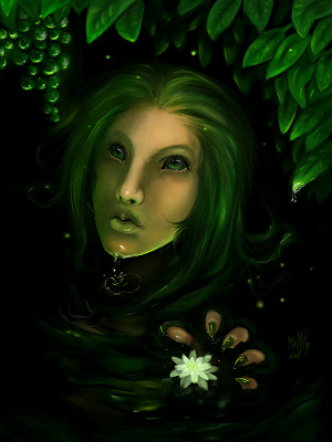
Our next piece comes to us from MeMilly:

The first thing I noticed was the lack of strong light source. It seems more of a soft ambiguous light. Instead of thinking of things like individual objects, a leaf here, grapes there, a face, etc. think of everything as having planes and shade accordingly. Like this:

Now you can more clearly think about where light and shade should fall. It looks a little like the image has a light source is coming from the front, a little up, and to the right. With that in mind, I would shade the face a little bit differently. I would focus on the highlights where the plane changes shift causing specular highlights that catch the light just right. With frontal light, the sides of the face should darken to help them recede into the background so I added some shading to either side of her face. I also enlarged her forehead as it looked a bit too small (typically, the forehead is the same distance from the brow to the hairline as the brow to the tip of the nose in a frontal view). I added a little texture, and I changed her hair quite a bit. It seemed to me like it would make more sense to have her hair be wet like her face. Wet hair clings to the head and is darker throughout with sudden specular highlights.

Lastly I added some more color variance to give the picture more interest. I realize this was a color challenge and you had a limited color pallet to work with, but I felt this gave it more interest.