Thursday, June 9, 2011

Simplification and it's grand rewards


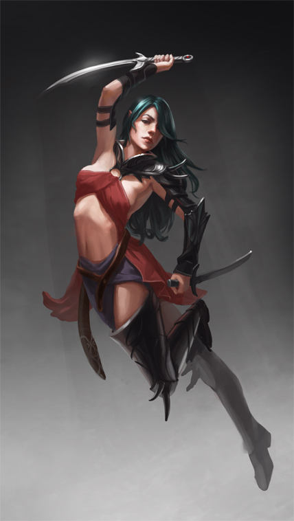
Greetings all! Guess what? I won the ImagineFX challenge again this month! :D Now I think it's time to step aside and give it a rest. I might still do the challenges but I won't post them in the finals. Here's the final winning image (but you can give me some crit over at conceptart.org).

It's nicely rendered, but I'd really like to loosen up my style. I think if I had a more defined style I would be a lot further along in getting into the industry. As it is, I border on being forgettable. Looking around some art sites, I've been greatly inspired by works like this:


FAFN forest defenders by ~Pervandr on deviantART
And this guy who blows me away- http://www.ruanjia.com/

I love how each stroke defines the form and yet doesn't over define it. It reminds me of the very powerful statement I read recently in a great art tutorial-
"The advantage art holds over photos is simplification. In a photo you'll get distracting details. When drawing, you can remove objects that aren't relevant to the scene. "

Each and every stroke should add something to the piece. If it's not needed, you shouldn't add it. That is a substantial thought. It really made me think. Hope it makes you think too. ;)

And here are a few quick sketches I've done in the past week trying to loosen up.


Ref- link

I still have a ways to go as you can see but I am trying.

During my studies this week I have discovered a way to replicate that really nice hard brush look I see in concept art. My hard round brush just wasn't doing the trick. So played around and discovered that the "oil heavy flow dry edges" brush set with low opacity and low flow gets close to the effect. Anyone else have a different technique? I used it for the tornado speed paint above. Here are my settings:


And as stated I have joined some more art communities. Leave me a message and we can hook up:

http://lithriel.cghub.com/
http://conceptart.org/forums/member.php?u=314321
http://lithriel.cgsociety.org/

Thursday, June 2, 2011

A Word on Eye Level

Many times in illustration we need to draw several subjects and objects in one scene. One mistake I have seen even the pros make is having multiple eye levels in one piece. What’s the big deal, you say? Well if your entire scene has the same perspective then eye level should be the same across the entire piece. There should only be one eye level.


What does eye level even mean? Eye level is the point at which you, the audience, is viewing something straight ahead. So if you were looking at a telephone pole at just 2 feet away you would have to look down to see the bottom of the pole and up to see the top but if you looked directly ahead you would see the middle of it.

How does that translate into the art world? If you are drawing a medieval dwarf up close at typical eye level (most people are about 5 to 6 feet tall) you would need to draw him as if the audience were looking down on his head. If you were drawing a tall monster terrorizing that same dwarf at close range, your eye level would hit maybe at the monster’s knees and you would be looking up at said monster’s chin. The problem occurs when you are looking down on both the monster and the dwarf because that’s not possible unless you as the audience is viewing the scene up in the sky, get me? You need to draw the monster in perspective in relation to the perspective already established in the rest of the scene.


Another time I see a problem is when I am looking at say, an illustration of a group of really cool people all standing behind the hero in an awesome v formation (because in the hero world everybody stands like this naturally). The illustration is looking so awesome, until I look at their feet. What’s wrong, you ask? I’m seeing everyone’s head at eye level and their feet too. You can’t do that remember? One eye level only please. I only have one set of eyes and they happen to be right next to each other not at my feet too.

In the case of looking at feet at eye level the bottom of the feet would be straight across. But if I am already looking at their heads at eye level, the feet should not be straight across. It’s either/or not both. If their feet are straight across then we need to be looking up at their heads.

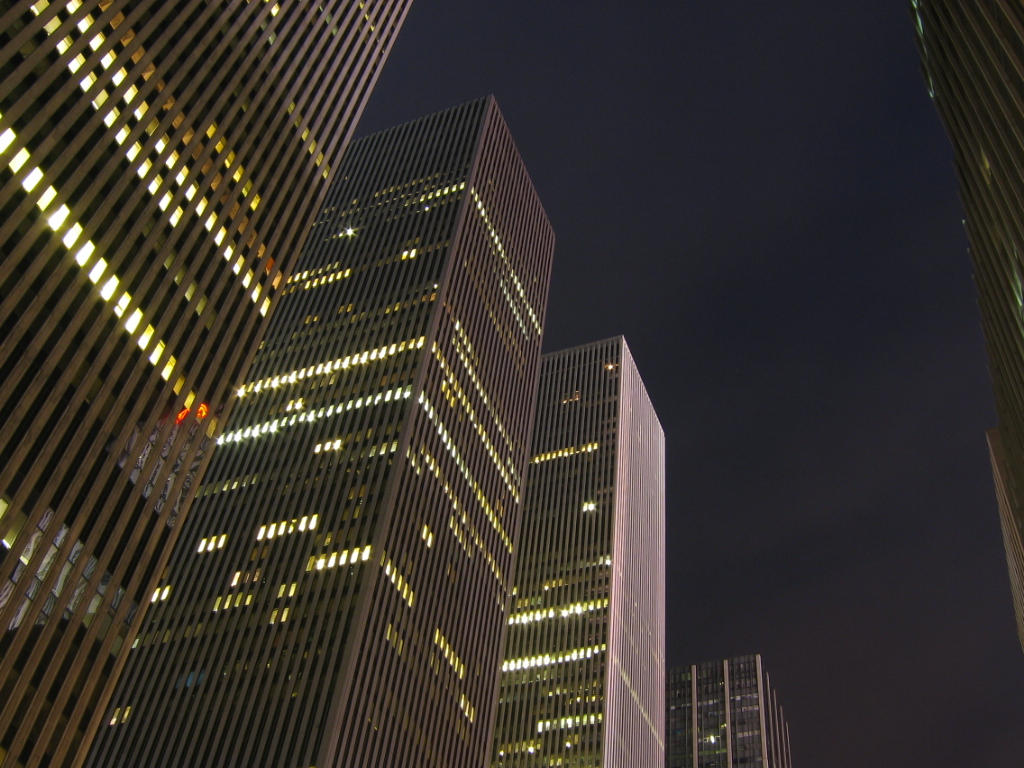
Think of it like taking a picture of really tall buildings from ground level.
See that crazy perspective? Figures are the same way when you are looking up from feet level.


The effect is reduced the further you stand back. If you were looking at the tallest man in the world face to chest, the effects of perspective looking up would be drastic whereas if you were looking at him from 50 feet away, it would be more subtle. If you happen to be looking at him from miles away and from up on top of a hill, you would actually be looking down on him because the eye level is the horizon.

Another quick word about ellipses. Just FYI- they follow perspective too. Go get yourself a cup, yes really, go grab one. It will help you understand this principle.

Now hold it right in front of your eyes. You should be seeing the cup straight across. Now hold it at elbow level and closely watch the shape of the opening. It goes from a straight line and morphs into an ellipse. Now set the cup at your feet. The shape of the opening is now a full circle. Now pick up the cup and hold it above your head. Look at the shapes of the ellipses. You can’t see the opening anymore. Remember that as you illustrate. All too often I see the tops of cups I shouldn’t see the tops to. Any cylindrical object above eye level you won’t see the top to unless it is tilted forward. And notice how the ellipses are wider the more you look down. Most people draw them in reverse. They draw the top of the bottle sitting on a table with a nice wide ellipse and the bottom nearly straight across. This is wrong.


Let’s recap.

There is only one eye level.
If you have already established eye level with one figure, the other figures in the scene need to be in perspective relative to what you have already established.
Feet should never be straight across unless you are looking at feet level
The eye level is the horizon.
You can’t see the tops to cylindrical objects above eye level unless they are tilted.
Ellipses get wider the further you get from eye level.

Yes, you can break the rules. Just make sure you know you are breaking them and break them on purpose. Happy illustrating!

Ashley

Wednesday, May 25, 2011

Evolution of an Artist- the advice of Daarken AKA Mike Lim

Ever feel like your art isn't good enough? We've all been there. I'm there right now at this very moment, but there is light at the end of the tunnel. Digital Illustrator Mike Lim shares his long journey as an artist with us in his recent blog post, Evolution of an artist.

He talks about his ever changing art- from his humble beginnings to his latest and greatest work. Along the way he gives fantastic advice about how to keep pushing yourself, and even offers a few well kept secrets about breaking into the industry:

"The reason I was able to get work without having to go out and find it for myself was because I had a very strong online presence"
Mikes states. "I posted on many different art forums, I had a website, a blog, and I made a lot of friends and contacts in the industry."

I have always believed that having an artistic network of friends is vital not only for the sake of your career, but for the sake of inspiration, motivation, and critic which helps to push you forward. These things may seem small but as Mike has demonstrated the payoffs can be huge. So if you are new to the art game I suggest joining all the biggest art communities:

The Art Order
Conceptart.org
CGhub.com
ImagineFX
Deviantart

Participate in the challenges, give critic to others, and accept critic with an open mind. This has helped to bring me to the level I am at currently, but I have a long way to go still. Just to give you an idea of my own progression, here is my first digital painting in August of 2009 (which I am totally embarrassed to even show), and here is my current work in progress:


The biggest difference I have seen from then to now is my transition from painting "typical pretty girls" to a more storytelling approach. This is a marked improvement because I have gone from a very reference heavy approach to a "make it up from your mind" take.

But remember how I started this post about saying how I don't think my work is quite where I want it to be? Give me three years and I know I could blow your socks off. Even in three years I will feel the same because there is always room for improvement.

Like Mike Lim states,"never give up... If being an artist is something you truly want to do, be prepared to put everything else aside in order to achieve that dream." And that ladies and gents is why I have been crawling into bed at midnight and getting up first thing in the morning to get in as much art as I can. I am committed for the long run. And if you are too, then get out that tablet and get drawing. That is the best advice anyone can give you.

Wednesday, May 11, 2011

Another Win Another DD

Surely one of these days someone is going to say something about how many DD's (daily deviation features) I've accrued. I'm up to 4 already as of today and it won't be long before people have had enough of me, I'm sure! =p My failed FEZ contest entry held by Deviant Art was chosen for the honor today and while I am quite proud at my contrast work with this piece it has several flaws. It didn't even make into the semi-finalists.


I wish they had just waited a little longer because I was seriously thinking about revamping this piece for my portfolio. There is such nice contrast and lighting going on and it's one of my most successful thumbnails or "reads well from a distance" pieces. Again I owe a shout out to the guys over at FZD School of Design for their amazing tutorials which frequently go over this very concept. However it's very low resolution, and I desperately want to rework some areas that I just ran out of time to address.

And would you believe it? I also won the April Monthly challenge over at ImagineFX? That means I will most likely be published again which is way way cool. :D At the same time though, my current monthly challenge (which I had the honor of choosing), has a much more complex and epic entry in progress which I feel merits publishing over last month's entry hands down. Here's a sneak peak:

Thursday, April 28, 2011

The Secret to good lighting- Beyond the Darkness

I have decided to enter the ImagineFX monthly challenge with the theme of "Beyond the Darkness". Along my journey of creating this piece I have pushed myself and have seen the fruits of my labors. You too can learn the secret to good lighting.

Several ideas popped into my head for this great theme and I sketched out several variations of different ideas. However, I realized I was entering the competition very late in the game (with a little over a week to go) and with a newborn in the house it would be better to do something less complex and more closeup. In the end I chose a rather typical image of an angel looking up into the light. The reason why I chose this is simply because I was itching to digitally paint a child and it seemed to fit the magazine's usual imagery well with emphasis on sci-fi and fantasy characters (which you should always think about when entering a competition) and it seemed to fit the theme best though rather straight forwardly.


The theme of "beyond the darkness" was the perfect opportunity to stretched my lighting skills even further. In my studies I have discovered that the secret to great lighting is knowing the difference between cast shadow and form shadow and NOT being afraid to create hard lines in your illustration. Don't be afraid that the shadow is going to look weird, just DO IT! You'll soon find that hard shadows in the right place makes your illustration look far more realistic.

I plan to do a tutorial very soon on lighting as it is one of the most successful tools in my arsenal. It was one of the most important things I learned during my classical art training in college but I didn't know how to properly implement it in an illustration setting until recently.

Next I want to push my illustrations to show more depth like the works of Glen Rane, Patrik Hjelm, and Steven Argyle.

Wednesday, April 13, 2011

Some Yummy Concept Art

A recent speed painting concept of mine:


As I have begun building up an illustration/concept art portfolio, I have wondered, what makes a good concept art piece? Concept art in and of itself is vastly different than illustration. As an artist is it sometimes good to have a solid grasp of both. From my research I have discovered the following:

Concept Art establishes mood, atmosphere, and scale. It should show value, space, and composition. Concept art should read well from a distance. Use value to establish a focal point and a clear idea. Perspective also is of great importance. Concept art is a means to an end. It isn't meant to be shown directly to an audience like illustration but handed to a team of 3D modelers and texture artists. Therefore if your perspective is off, it is harder for someone else to work with what you have. It may be confusing, or be impossible to replicate in a 3D environment.

Concept Art subject matter varies and so should your skill set. Concept art can be anything from character design, creature design, storyboards, machinery design, and environment design. Films usually have the budget to hire artists for each specific category of concept art but game designers usually need fewer artists with a wider range of skills. It's also a good idea to show both organic and inorganic elements.

A great resource for concept art is the site FZD School of Design. They have several video tutorials which go over everything I have just described above. Check them out if you have a chance.

Saturday, April 9, 2011

I'm Back!! DAZ Studio and W.I.P. Podcast

Sorry for the long absence. I switched over to deviantart as my main art account for a while but I am back. I'll be posting art and links to great resources on here as I continue to build my art portfolio and find useful links.

Speaking of which, there's a great group of artists who get together and critique artwork the first Wednesday of every month- W.I.P. Podcast I posted my work last week and got some great critique on my latest piece. Here's the before and after pictures:


As you can see, I changed the hair and finished the legs. Much better. I tend to fall into the trap of making my subject matter "pretty" instead of realistic and the most helpful comment was to give the hair as much dynamic movement as the rest of the piece. It's ALWAYS good to have another pair of eyes catch the things you don't even notice.

Check out the forums as well. There's a great little community over there for people to post work. It's a great stepping stone for beginners just getting into things who want to get critique. Also building a network of artistic friends is a great way to get your foot into the industry. Plus, you can't go wrong by offering others some helpful comments. The podcasts are very informational as well.


Another great resource I stumbled upon was a link on The Art Educators Blog about DAZ Studio- a great 3D resource for posing. I've played around with it a little bit and it looks promising for getting reference for poses that are hard to catch (like action poses) and for getting reference of body types that are hard to find. I'll play around with it some more but I'm not sure how useful the program will be when my 30 day trial is over. Plus you really need to buy a couple of packages for it to really be useful and I'm not keene on putting a lot of money into something that is supposedly free (but all the content costs money). The picture to the right is a quick snap shot I took of an action pose. Cool stuff, no?